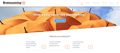
Since we devote considerable space to branding strategy, we wanted to share an insider’s look at how we updated our own brand identity. And yes, we used the same process we recommend for clients.
Launching the Brainzooming blog in 2008, I used a wordmark that conveyed a balance of industrial and irreverent that represented the content and our take on making strategy fun. With the business launch in 2009, we modified the look and logo to include an orange square as a partial platform for our name. It showed we understood there was a box, while always innovating away from it.
With the new website development reflecting changes in our branding strategy over the years, our goal was creating an updated visual identity. The strategic creative brief called for a look that continued to suggest a mentally stimulating brand experience that is simple and fun. We also wanted to emphasize the role that collaboration plays within our work, with a design that put us on par with brand name strategy consultants we’re beating out for new business. Finally, with the addition of the Idea Magnets brand, and other brands in the offing, the identity system needed to allow for flexibility and growth, while anchoring everything to Brainzooming.
A New Identity Representing an Updated Branding Strategy
The brief called for a lot, and our external graphics partner delivered on the expectations underlying our branding strategy.

This is the primary visual for Brainzooming services, underscored by our corporate identity, The Brainzooming Group. We chose Kollektif for the primary visual font for two reasons. First, because of the smooth, clean lines that suggest simplicity and forthrightness; second, because of the interesting concepts the letter shapes suggest, such as eyes and a nose within the “zoo”, and the lowercase g that suggests someone talking.
To the right is the Orange Squircle, which neatly doubles as a conversation bubble. And yes, a squircle is a thing, with a mathematical definition and rounded edges that allow them to stack more closely than squares. That fits nicely into the key concepts we espouse: close collaboration and strategic conversations. The orange squircle conversation bubble also frames icons representing our growing line of services, products, and content. The primary logo features a brain comprising a variety of connections, representing the zooming we create among individuals, teams, and ideas. As we expand our offerings and branding strategy, the orange squircle sets the stage for new developments and corresponding icons.
We firmly believe in the results of using the Brainzooming Method. So, mirroring the approach we take with clients was important to us. That’s why the strategic and creative aspects of our brand identify design were closely intertwined. Every creative modification began with a strategic reason and was vetted for both graphic appeal and how hard it worked to deepen a strategic understanding of what we offer to all of you. – Mike Brown


